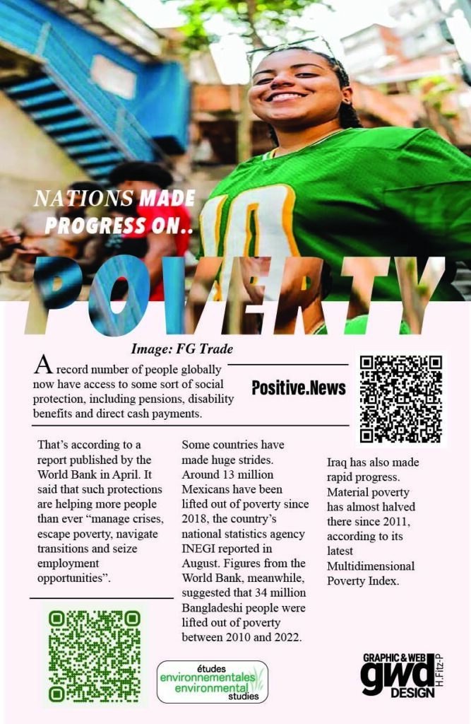
The Positive News poster was created as part of a project where we had to choose a story from a Positive News article and turn it into a poster that communicated its message visually. I chose a story about the decrease in poverty in Brazil because I wanted to highlight a positive change happening in the world. As part of the assignment, we were required to use the photograph from the original article, which became the main visual element of my design. From there, I worked on building a layout that would connect the image with the story while making the main message clear to the viewer.
One of the main design choices I focused on was typography. I wanted the text to stand out while still working with the photograph rather than competing with it. I experimented with the placement and size of the words, using the word “POVERTY” as an important visual element in the composition. I used a clipping mask to incorporate the photograph into the text, creating a connection between the imagery and the subject of the article. This allowed me to treat the typography as more than just information and make it part of the overall visual concept. I also considered the colours, layout, and composition to help the different elements work together and create a poster that was visually engaging while communicating the story’s message.
For my design process, I used Adobe Photoshop to resize the original photograph so it would fit the dimensions of my canvas. I then used Adobe Illustrator to build the rest of the poster, including the typography and overall layout. Working between the two programs allowed me to prepare the image and develop the design around it. However, getting the photograph to fit properly was one of my challenges, especially when trying to stretch it to suit the composition without affecting how it looked. I also had difficulty creating the clipping mask for the word “POVERTY” and figuring out how to fit the text into the canvas while keeping it legible. I had to consider how the size, spacing, and placement of the text affected the overall design, making sure the message remained easy to read without losing its visual impact.
Overall, this project helped me explore how photography and typography can work together to communicate a news story.
Follow for more projects
Stay connected and explore more projects and designs