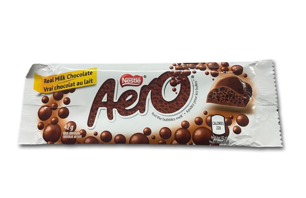
The Project
This chocolate packaging project was part of an assignment where we were given the freedom to redesign any product, brand, or poster of our choice. I decided to redesign an Aero chocolate wrapper after noticing a photo of the packaging on my phone from a previous class. I had always felt that the bubbles in Aero chocolate gave the product a space-like appearance, which inspired me to explore a space-themed concept for my design. Although it was a last-minute decision, I wanted to take that initial idea and turn it into something playful and visually interesting. Instead of simply recreating the original wrapper, I wanted to give the packaging my own creative direction through the colours, typography, and illustrations.
The New Concept
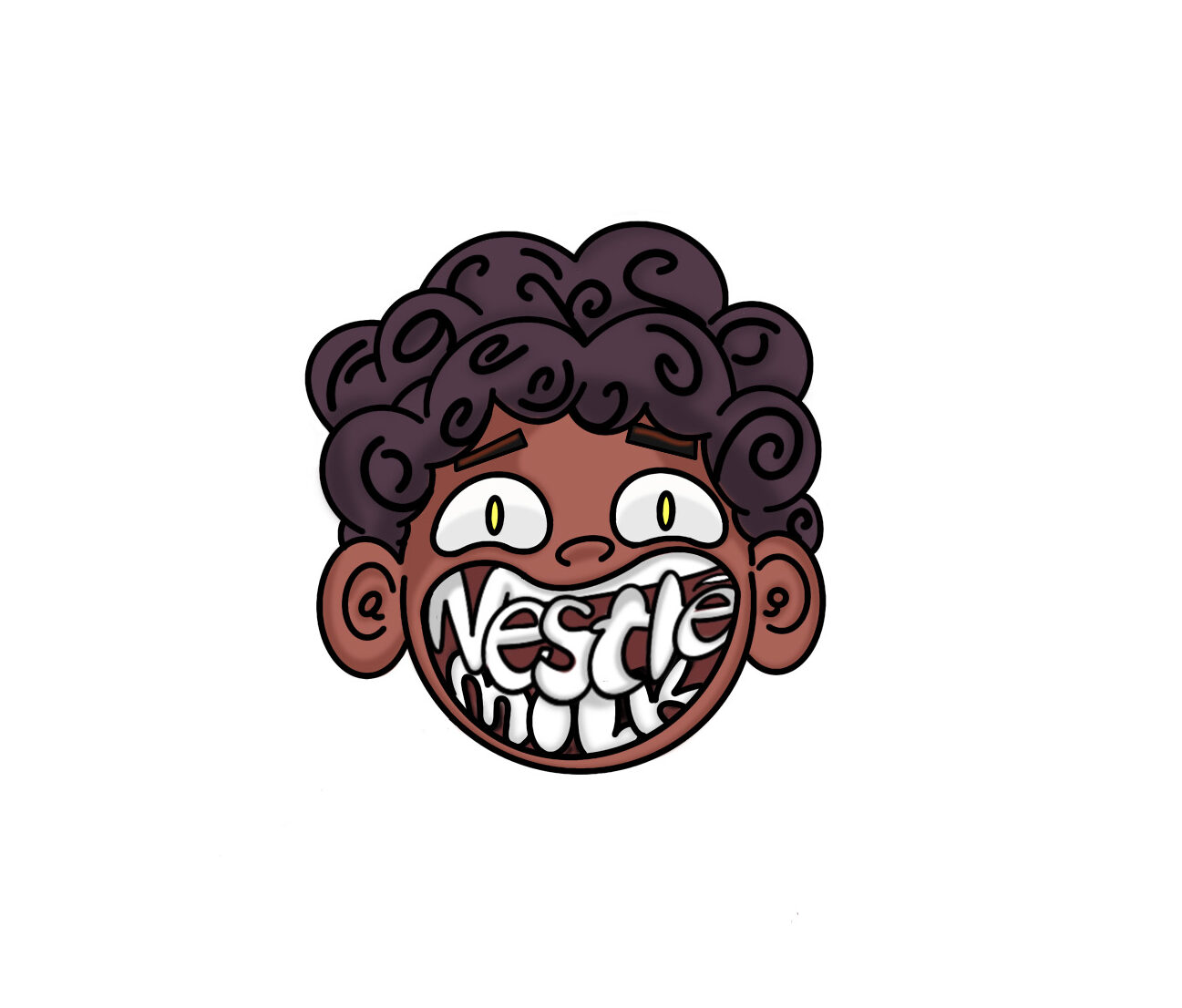
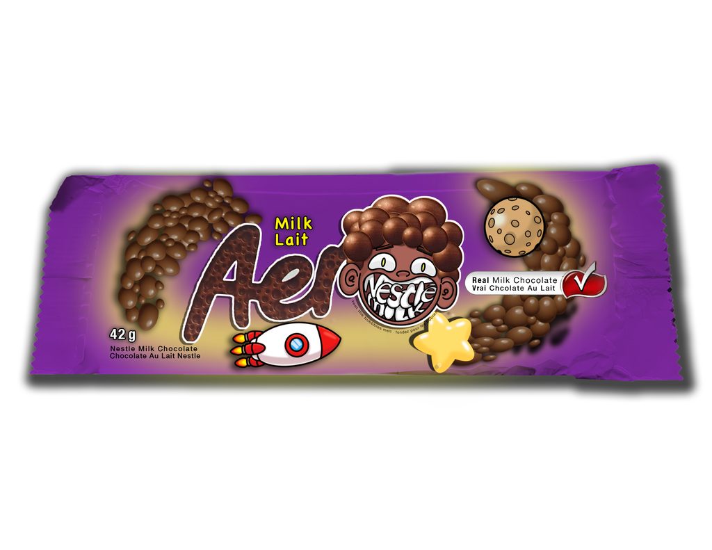
One of the main elements of my design was the illustration. I used Procreate to create the character and visual elements that would bring the concept to life. I wanted the illustration to fit the playful, imaginative feeling of the space theme and help give the packaging its own personality. I also experimented with the colours and typography to create a design that felt cohesive with the overall concept. These choices were important because I wanted the wrapper to look like a chocolate product while still having a distinctive style that would catch someone’s attention. By combining the illustrated elements with the packaging design, I aimed to create something that felt fun, creative, and different from the original Aero wrapper.
The Process
For the design process, I used Procreate to create the illustration and Adobe Photoshop for the rest of the design work. One of the biggest challenges I faced was recreating the chocolate bubbles, since they are such a recognizable feature of Aero chocolate. I wanted to represent the bubbles in a way that connected to my space-themed idea while still making them look like the chocolate itself. Another challenge was developing the overall concept. Because my decision to redesign Aero came at the last minute, I had to figure out how to turn the connection between the chocolate bubbles and space into a complete visual direction. This meant thinking about how the illustrations, colours, and typography could work together rather than treating each element separately.